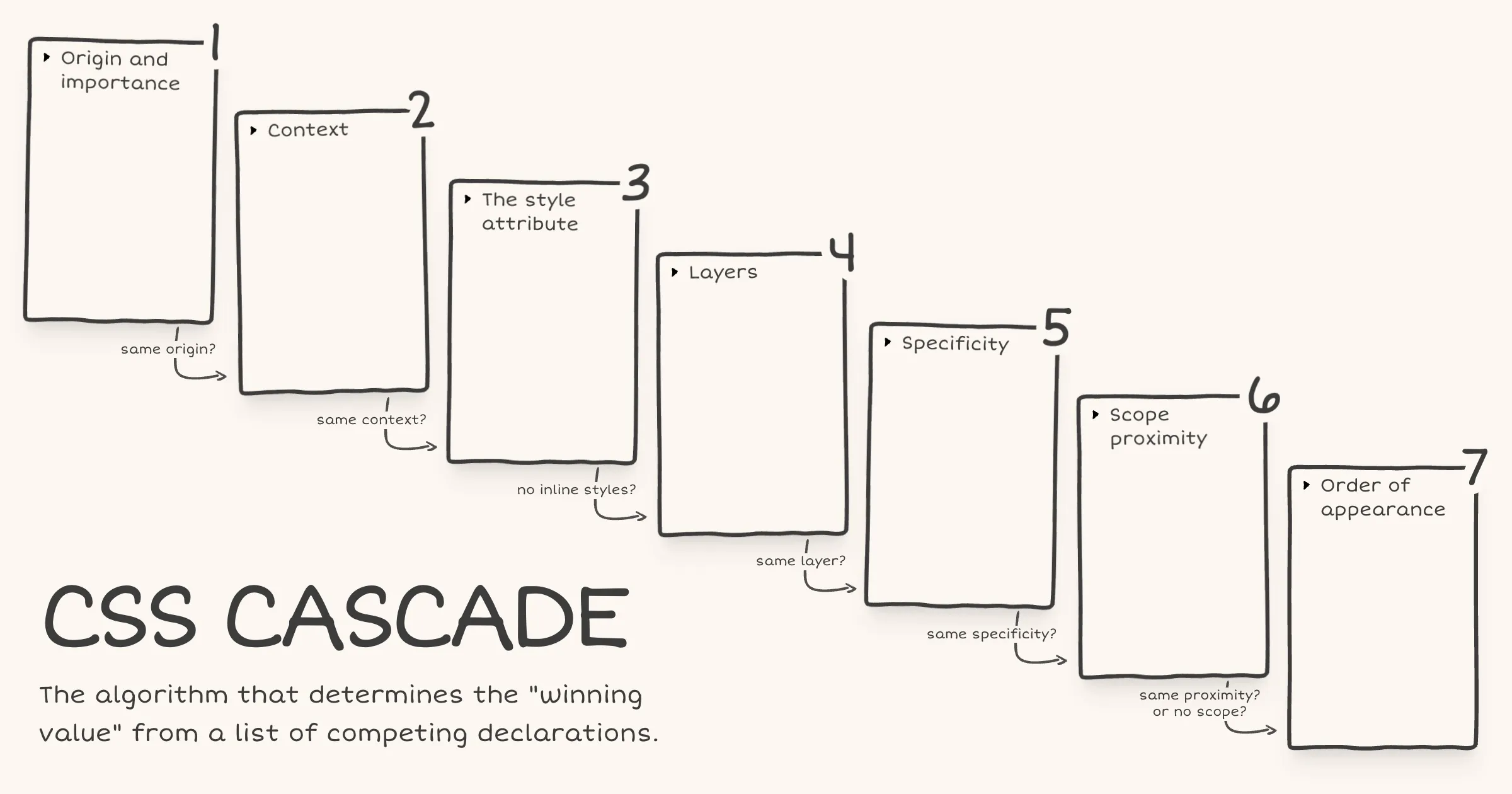
• Inherited properties leak through the donut scope

    Today I learned about a potential pitfall with @scope.

    Via MDN [emphasis mine]:

    It is important to understand that, while @scope allows you to isolate the application of selectors to specific DOM subtrees, it does not completely isolate the applied styles to within those subtrees. This is most noticeable with inheritance — properties that are inherited by children (for example color or font-family) will still be inherited, beyond any set scope limit.

    In other words, @scope isolates your selectors, not your styles. Here’s what that looks like in practice.

    <article class="card">
      <p>In scope</p>
      <div class="content">
        <p>Outside the scope limit</p>
      </div>
    </article>
    @scope (.card) to (.content) {
      :scope {
        color: red;
        font-family: Georgia, serif;
      }
    
      p {
        padding: 1lh;
        outline: 1px solid;
      }
    }

    The second <p>, the one inside .content, won’t get the padding or outline because those are non-inherited properties in the scope limit. That part works exactly as you’d expect.

    But it will still turn red and render in Georgia because color and font-family are inherited properties set on .card (via :scope). And as we just learned from MDN, inheritance flows through the DOM regardless of where @scope sets the scope limit.

    As Miriam mentioned in the Winging It episode on CSS Scope & Mixins, it has to work this way because if @scope blocked inheritance at the scope limit, every element beyond the scope limit would receive the initial value for each inherited property.

    initial applies the value as defined in the CSS spec. And that would be far more destructive than letting inheritance flow through.

    If you’re coming from JavaScript, you might expect custom properties to work like scoped variables work in JavaScript. But in CSS, custom properties are inherited properties just like color or font-family.

    @scope (.card) to (.content) {
      :scope {
        --text-color: red;
        font-family: Georgia, serif;
      }
    
      p {
        color: var(--text-color);
        padding: 1lh;
        outline: 1px solid;
      }
    }
    
    /* This rule exists to show that the inherited value is available beyond the scope limit */
    .content p {
    	color: var(--text-color);
    }

    With the same HTML, the second <p> again loses the padding and outline. But --text-color inherits down from .card into .content p. So the second <p> also turns red because its color property references var(--text-color) which resolves to red.

    For custom properties, if inheritance were blocked at the scope limit and no ancestor outside the scope had also defined it, any var(--text-color) beyond the scope limit would be undefined and that would just trigger the fallback in the var() function, or if there’s no fallback, the property using it would behave as unset.

    There’s more to what happens when a custom property is undefined, involving the guaranteed-invalid value and invalid at computed-value time (IACVT). I wrote a note on what happens when the CSS function var() references an undefined custom property.

  • Note - Posted on

    What happens when the var() CSS function references a custom property that is undefined or explicitly set to initial?

    In both cases the custom property’s value is the guaranteed-invalid value. That’s the initial value of every custom property as defined in the spec. When var() encounters this value during substitution, here’s what happens:

    1. If a fallback was provided, the fallback value is used.
    2. If no fallback was provided, the referencing property becomes invalid at computed-value time (IACVT). The property then behaves as if its value had been specified as the unset keyword.
  • Note - Posted on

    I just read the latest issue of Chris’ Corner on CodePen. I then read the following articles, all of which Chris links to:

    Oh boy! My mind is completely fried. I had no idea anchor positioning was this complicated. I would be afraid to touch CSS anchor positioning if not for this recommendation from James to make it work reliably.

    1. Make the anchor and the positioned element siblings.
    2. Put the anchor first in the DOM.

    I also saw the Winging It episode on ‘Debugging CSS Anchor Positioning‘. It really helped me develop a mental model of how anchor positioning works and why the gotchas exist.

    Also, I totally agree with Tab Atkins-Bittner that dev tools really need a way to show the containing block for elements, especially absPos/fixedPos elements.

  • Note - Posted on

    I liked Kevin Powell’s video on the slide-in nav. In the video, Kevin demonstrates how to create a sticky header that initially scrolls away (when the user scrolls the page), then slides back into view as a sticky top bar once the user has scrolled past a certain threshold.

    He achieves the slide-in effect using scroll state queries and a negative inset-block-start on the sticky positioned element.

    He also recreates the effect using scroll driven animations. But it’s not an ideal solution, since as he puts it speaking about the header, “if I stop at the wrong spot, it’s like halfway there”. That is definitely a usability issue.

    I remembered Bramus sharing his post on scroll triggered animations. As Bramus mentions, scroll triggered animations “trigger when crossing a specific scroll offset”. This is exactly what’s required to avoid the problem Kevin mentioned above.

    Here’s my CodePen demo achieving the slide-in effect using scroll triggered animations.

    I tested it on Chrome Canary v147. No other browser seems to support it yet, not even Chrome v145 even though Bramus’ article says it ships with v145. On browsers that don’t support scroll triggered animations, there is no slide-in effect but the header remains sticky.

  • Note - Posted on

    I keep forgetting how each of the following CSS values rolls back a declaration to a different point in the cascade. It was about time I jotted it down for my future self before it slips my mind again for the 1000th time.

    initial
    Applies the initial value as defined in the CSS spec
    unset
    Inherits or falls back to the initial value
    revert
    Reverts to the user agent's default value
    revert-layer
    Rolls back to the value in a previous cascade layer
  • Note - Posted on

    I’ll be attending State of the Browser for the first time, remotely! 💃🏻

    Really looking forward to Bramus’ talk on CSS Anchor Positioning and Zach’s talk on reducing the JS footprint.

  • zachleat’s Twitter Archive—№ 20,184

    Zach Leatherman on frontend architecture and building for longevity amid framework churn:

    1. 👏 Hire someone that’s good at HTML and CSS to build components independent of JS frameworks 👏
    2. Plug components into a JS framework and layer on behavior later
    3. Pay HTML/CSS devs what they deserve for giving part of your codebase longer shelf life than unpasteurized milk
  • Note - Posted on

    Today I learned that setting type="reset" on a <button> element in HTML creates a reset button that, when activated, immediately clears all form data, resetting it to its initial state.

    This could have been useful in the context of a search form. But <input type="search"> already provides a native clear button for that single field.

  • Saying “No” In an Age of Abundance - Jim Nielsen’s Blog

    It’s never been a good idea to ship everything you think of. Every addition accretes complexity and comes with a cognitive cost.

    Maybe we need to reframe the concept of scarcity from us, the makers of software, to them, the users of software. Their resources are what matter most:

    • Attention (too many features and they can’t all be used, or even tried)
    • Stability (too much frequent change is an impediment to learning a product)
    • Clarity (too many options creates confusion and paralysis)
    • Coherence (too many plots and subplots cannot tell a unified story)
  • Singing the gospel of collective efficacy (Interconnected)

    Similarly we all love when the swifts visit (beautiful birds), so somebody started a group to get swift nest boxes made and installed collectively, then applied for subsidy funding, then got everyone to chip in such that people who couldn’t afford it could have their boxes paid for, and now suddenly we’re all writing to MPs and following the legislation to include swift nesting sites in new build houses. Etc.

    It’s called collective efficacy, the belief that you can make a difference by acting together.

  • Pedagogy Recommendations

    Every time you are inclined to use the word “teach”, replace it with “learn”. That is, instead of saying, “I teach”, say “They learn”. It’s very easy to determine what you teach; you can just fill slides with text and claim to have taught. Shift your focus to determining how you know whether they learned what you claim to have taught (or indeed anything at all!). That is much harder, but that is also the real objective of any educator.

  • Note - Posted on

    Just spent some time playing with OKpalette, a color extraction tool by David Aerne, and I’m in awe.

    The 3D spinning text pulled me in immediately. I assumed it was done using JavaScript because it reminded me of the Space Type Generator. Finding out it’s done using CSS genuinely blew my mind. David was kind enough to share a CodePen demo.

    I loved the animations and the subtle use of audio while interacting with the UI. Then I watched David’s walkthrough / demo and realized the functionality is just as beautiful as the visuals, if not more.

  • Note - Posted on

    The reasonable man adapts himself to the world; the unreasonable man persists in trying to adapt the world to himself. Therefore, all progress depends on the unreasonable man.

    I learned about this quote by George Bernard Shaw from Veritasium’s video on The World’s Most Important Machine

    It instantly reminded me of the Kaun Hai Tu scene from Gully Boy, where Murad embodies Shaw’s “unreasonable man.” In this scene, Murad is confronted by his father after quitting his job to pursue his dream. The father tries to convince Murad that his dreams need to match his reality. Murad then answers that he will change his reality to match his dreams.

  • How to choose your Baseline target | Articles | web.dev

    Jeremy Wagner and Rachel Andrew explain how to use analytics to select a Baseline target and what to do when you don’t have any real user data.

    In cases where there isn’t any real user data:

    […] you can get a general idea of support for different Baseline targets through RUM Archive Insights, even allowing you to filter down to the country level.

    They also address a practical follow-up question: what to do about features that don’t meet your chosen Baseline target.

    Baseline doesn’t prescribe a specific path here, but the authors suggest a useful framework for categorizing features based on their “failure mode”:

    • Enhancement: If the feature is used in an unsupported browser, the experience is not broken. The experience could possibly be degraded, but may not likely be noticeable to the user. Example: loading="lazy".
    • Additive: The feature provides some additive benefits that may be noticeable—such as changes in page styling or some functionality. The difference may not be noticeable to users if the feature is unsupported, barring comparison in a browser that does support it. Example: Subgrid
    • Critical: If the feature is unsupported, the user will have a negative user experience—possibly even one that’s broken altogether. Example: File System Access API used as a central and necessary feature.

    They also highlight Clearleft’s browser support policy, where they target Baseline Widely available while still evaluating whether newer features can be used as progressive enhancements before ruling them out entirely.

  • Jason Pamental - The Life of p - YouTube

    I just saw Jason Pamental’s excellent talk on ‘The Life of <p>’. In this talk, Jason traces the evolution of paragraph design in print and shows how those typographic ideas can be applied using CSS.

    There’s one moment during the Q&A where Jason mentions:

    […] you see the page gets small, but they don’t change the scale of the headers. So you end up with like an <h1> with one word per line. It’s a really awkward break. So I think proportion with varying screen size is probably the most overlooked thing right now that I’d want to see people think about more.

    I wasn’t a web developer 10 years ago when Jason gave this talk, but with over five years of experience now, it’s striking that I only became aware of proportional type scaling as an idea in the last couple of years. Nowadays, I use utopia.fyi to create fluid type (and space) scales across viewport ranges, which helps address the problem Jason mentioned.