Harry Roberts on what CSS containment actually is, what each contain value does, and how to use it confidently on real projects without creating hard-to-debug side effects.
Tagged: css
Note - Posted on
Last week, I built a visual explainer of the CSS Cascade.
I used anchor positioning with chained anchors to stack the cascade steps. It worked, but Safari 26.4 and earlier had a bug with chained anchors, so I had to exclude Safari entirely via an
@supportshack.I wasn’t entirely happy with that, so I refactored the layout to use a subgrid based approach with
grid-template-areas. Since subgrid became Baseline Widely Available recently, the timing also worked out.While I was at it, I also restructured the HTML such that each cascade step is now a list item inside an ordered list, which gives better semantics.
Note - Posted on
I built a visual explainer of the CSS Cascade, the algorithm that determines the “winning value” from a list of competing declarations.
After Web Day Out 2026, I was checking out Manuel Matuzović’s UA+ stylesheet. Manuel mentioned that he wraps all rules in an anonymous layer to avoid specificity issues. I realised I didn’t actually understand how anonymous layers worked, so I went back and re-read Miriam Suzanne’s cascade layers guide on CSS-Tricks. I really liked the way Miriam presented the cascade and specifically the order of precedence within each step.
Recently, while learning
@scope, I had come across a diagram of the cascade in Bramus’ article on@scope. I had seen it before in his CSS Day 2022 talk as well but this time it stuck with me. The layout just made the cascade click visually.I wondered if I could combine Bramus’ cascade diagram layout with the order of precedence information from Miriam’s article. The early CodePen prototype turned out well enough that I decided to polish and publish it.
There are still some things to be done. The website currently fails WCAG Success Criterion 1.4.4: Resize Text (Level AA) under certain conditions. I haven’t landed on a fix that works for the design yet. Hit me up if you have any ideas.
Inherited properties leak through the donut scope
Today I learned about a potential pitfall with
@scope.Via MDN [emphasis mine]:
It is important to understand that, while
@scopeallows you to isolate the application of selectors to specific DOM subtrees, it does not completely isolate the applied styles to within those subtrees. This is most noticeable with inheritance — properties that are inherited by children (for examplecolororfont-family) will still be inherited, beyond any set scope limit.In other words,
@scopeisolates your selectors, not your styles. Here’s what that looks like in practice.<article class="card"> <p>In scope</p> <div class="content"> <p>Outside the scope limit</p> </div> </article>@scope (.card) to (.content) { :scope { color: red; font-family: Georgia, serif; } p { padding: 1lh; outline: 1px solid; } }The second
<p>, the one inside.content, won’t get thepaddingoroutlinebecause those are non-inherited properties in the scope limit. That part works exactly as you’d expect.But it will still turn red and render in Georgia because
colorandfont-familyare inherited properties set on.card(via:scope). And as we just learned from MDN, inheritance flows through the DOM regardless of where@scopesets the scope limit.As Miriam mentioned in the Winging It episode on CSS Scope & Mixins, it has to work this way because if
@scopeblocked inheritance at the scope limit, every element beyond the scope limit would receive the initial value for each inherited property.initialapplies the value as defined in the CSS spec. And that would be far more destructive than letting inheritance flow through.If you’re coming from JavaScript, you might expect custom properties to work like scoped variables work in JavaScript. But in CSS, custom properties are inherited properties just like
colororfont-family.@scope (.card) to (.content) { :scope { --text-color: red; font-family: Georgia, serif; } p { color: var(--text-color); padding: 1lh; outline: 1px solid; } } /* This rule exists to show that the inherited value is available beyond the scope limit */ .content p { color: var(--text-color); }With the same HTML, the second
<p>again loses thepaddingandoutline. But--text-colorinherits down from.cardinto.content p. So the second<p>also turns red because itscolorproperty referencesvar(--text-color)which resolves tored.For custom properties, if inheritance were blocked at the scope limit and no ancestor outside the scope had also defined it, any
var(--text-color)beyond the scope limit would be undefined and that would just trigger the fallback in thevar()function, or if there’s no fallback, the property using it would behave asunset.There’s more to what happens when a custom property is undefined, involving the guaranteed-invalid value and invalid at computed-value time (IACVT). I wrote a note on what happens when the CSS function
var()references an undefined custom property.Note - Posted on
What happens when the
var()CSS function references a custom property that is undefined or explicitly set toinitial?In both cases the custom property’s value is the guaranteed-invalid value. That’s the initial value of every custom property as defined in the spec. When
var()encounters this value during substitution, here’s what happens:- If a fallback was provided, the fallback value is used.
- If no fallback was provided, the referencing property becomes invalid at computed-value time (IACVT). The property then behaves as if its value had been specified as the
unsetkeyword.
Note - Posted on
I just read the latest issue of Chris’ Corner on CodePen. I then read the following articles, all of which Chris links to:
- Chris’ article on The Big Gotcha of Anchor Positioning
- Temani Afif’s article on Why is Anchor Positioning not working?
- James Stuckey Weber’s article on CSS Anchor Positioning in Practice
Oh boy! My mind is completely fried. I had no idea anchor positioning was this complicated. I would be afraid to touch CSS anchor positioning if not for this recommendation from James to make it work reliably.
- Make the anchor and the positioned element siblings.
- Put the anchor first in the DOM.
I also saw the Winging It episode on ‘Debugging CSS Anchor Positioning‘. It really helped me develop a mental model of how anchor positioning works and why the gotchas exist.
Also, I totally agree with Tab Atkins-Bittner that dev tools really need a way to show the containing block for elements, especially absPos/fixedPos elements.
Note - Posted on
I liked Kevin Powell’s video on the slide-in nav. In the video, Kevin demonstrates how to create a sticky header that initially scrolls away (when the user scrolls the page), then slides back into view as a sticky top bar once the user has scrolled past a certain threshold.
He achieves the slide-in effect using scroll state queries and a negative
inset-block-starton the sticky positioned element.He also recreates the effect using scroll driven animations. But it’s not an ideal solution, since as he puts it speaking about the header, “if I stop at the wrong spot, it’s like halfway there”. That is definitely a usability issue.
I remembered Bramus sharing his post on scroll triggered animations. As Bramus mentions, scroll triggered animations “trigger when crossing a specific scroll offset”. This is exactly what’s required to avoid the problem Kevin mentioned above.
Here’s my CodePen demo achieving the slide-in effect using scroll triggered animations.
I tested it on Chrome Canary v147. No other browser seems to support it yet, not even Chrome v145 even though Bramus’ article says it ships with v145. On browsers that don’t support scroll triggered animations, there is no slide-in effect but the header remains sticky.
Underlining Links With CSS | Always Twisted
Today I learned about the CSS property
text-underline-position. As Stuart mentions,the
undervalue forces the underline to sit below all the descenders, giving you a consistent baseline.a { text-underline-position: under; }Note - Posted on
I keep forgetting how each of the following CSS values rolls back a declaration to a different point in the cascade. It was about time I jotted it down for my future self before it slips my mind again for the 1000th time.
initial- Applies the initial value as defined in the CSS spec
unset- Inherits or falls back to the initial value
revert- Reverts to the user agent's default value
revert-layer- Rolls back to the value in a previous cascade layer
Web development tip: disable pointer events on link images
The problem is that Live Text, “Select text in images to copy or take action,” is enabled by default on iOS devices (Settings → General → Language & Region), which can interfere with the contextual menu in Safari. Pressing down on the above link may select the text inside the image instead of selecting the link URL.
Note - Posted on
Just spent some time playing with OKpalette, a color extraction tool by David Aerne, and I’m in awe.
The 3D spinning text pulled me in immediately. I assumed it was done using JavaScript because it reminded me of the Space Type Generator. Finding out it’s done using CSS genuinely blew my mind. David was kind enough to share a CodePen demo.
I loved the animations and the subtle use of audio while interacting with the UI. Then I watched David’s walkthrough / demo and realized the functionality is just as beautiful as the visuals, if not more.
Jason Pamental - The Life of p - YouTube
I just saw Jason Pamental’s excellent talk on ‘The Life of
<p>’. In this talk, Jason traces the evolution of paragraph design in print and shows how those typographic ideas can be applied using CSS.There’s one moment during the Q&A where Jason mentions:
[…] you see the page gets small, but they don’t change the scale of the headers. So you end up with like an
<h1>with one word per line. It’s a really awkward break. So I think proportion with varying screen size is probably the most overlooked thing right now that I’d want to see people think about more.I wasn’t a web developer 10 years ago when Jason gave this talk, but with over five years of experience now, it’s striking that I only became aware of proportional type scaling as an idea in the last couple of years. Nowadays, I use utopia.fyi to create fluid type (and space) scales across viewport ranges, which helps address the problem Jason mentioned.
Note - Posted on
Today I learned that on macOS, with the default scrollbar setting enabled, classic scrollbars are shown automatically when a mouse is connected. I used to believe that, mouse or not, users needed to explicitly change the scrollbar appearance to get the classic scrollbars.
This is relevant for everyone who builds websites because when classic scrollbars are shown, the value of
100vwincludes the scrollbar width. This can cause an unexpected horizontal overflow if the layout relies on100vwfor full-width elements. Additionally, they affect media queries, which assume scrollbars don’t exist when evaluating viewport width.Having said that, these aren’t new issues. Classic scrollbars are shown by default on Windows, where the same behaviours apply.
Further reading:
View transitions: Handling aspect ratio changes
To be honest, I had a tough time understanding this article completely. But that is a me problem because I think I don’t have the right mental model for view transitions yet. Nevertheless, I’m sure this article will be super helpful someday in the future.
Note - Posted on
Today I learned,
:root(0-1-0) has a higher specificity thanhtml(0-0-1).In hindsight, it’s obvious.
:rootis a CSS pseudo-class selector and, like most pseudo-class selectors, it has the same specificity as a class selector or an attribute selector.Note - Posted on
Stupid #CSS question because I’m losing my mind here: why isn’t calc(.5*a) working? What am I missing? It doesn’t seem to be working in any browser.
Ana is trying to use
calc(.5 * a)as a part of the relative color syntax, presumably to create semi transparent outlines. But it is not working becausecalc(.5 * a)is an invalid property value. As Valtteri Laitinen replied, it should actually bealphain there instead ofa..class { outline-color: rgb(from currentcolor r g b / calc(0.5 * a)); /* ❌ invalid */ outline-color: rgb( from currentcolor r g b / calc(0.5 * alpha) ); /* ✅ valid */ }Note - Posted on
I was reading Manuel Matuzovic’s article on meta theme color and came across this snippet:
<style> :root { --theme: blue; } </style> <meta name="theme-color" content="var(--theme)" />I wish it was possible to access custom properties outside the
<style>tag in the<head>. It would keep things DRY.Note - Posted on
Today I learned,
grid-auto-columnsandgrid-auto-rowssize implicit tracks as well as any explicit tracks that are not explicitly sized by bygrid-template-rowsorgrid-template-columns.Until now, I was under the impression that
grid-auto-rowsandgrid-auto-columnssize only implicit grid tracks.Why is `grid-row: 1/-1` not working?
The
grid-rowgrid-placement property is shorthand forgrid-row-startandgrid-row-end..grid-item { grid-row: 1/-1; /* is equivalent to */ grid-row-start: 1; grid-row-end: -1; }In the above declaration, we use integers to position and size the grid item by line numbers.
As per the spec:
Numeric indexes in the grid-placement properties count from the edges of the explicit grid. Positive indexes count from the start side (starting from 1 for the start-most explicit line), while negative indexes count from the end side (starting from -1 for the end-most explicit line).
The important bit is the explicit grid. This begs the question …
What is the explicit grid?
As per the spec:
The three properties
grid-template-rows,grid-template-columns, andgrid-template-areastogether define the explicit grid of a grid container by specifying its explicit grid tracks.Simply put, the explicit grid consists of manually defined rows and columns.
The size of the explicit grid is determined by the larger of the number of rows/columns defined by
grid-template-areasand the number of rows/columns sized bygrid-template-rows/grid-template-columns. Any rows/columns defined bygrid-template-areasbut not sized bygrid-template-rows/grid-template-columnstake their size from thegrid-auto-rows/grid-auto-columnsproperties. If these properties don’t define any explicit tracks the explicit grid still contains one grid line in each axis.That last bit is what leads to line -1 being the same line as 1 because the explicit grid still contains one grid line in each axis.
What is the implicit grid?
As Manuel Matuzovic puts it:
If there are more grid items than cells in the grid or when a grid item is placed outside of the explicit grid, the grid container automatically generates grid tracks by adding grid lines to the grid. The explicit grid together with these additional implicit tracks and lines forms the so called implicit grid.
Conclusion
Paraphrasing Jen Simmons:
- -1 is the last line of the explicit grid
- If you haven’t defined any explicit rows, then all your rows are implicit
- For implicit rows, -1 is the same line as 1
- Define explicit rows and
grid-row: 1/-1will work as expected
Further Reading
Note - Posted on
I got the opportunity to proofread Ahmad Shadeed’s latest article on CSS Grid Areas before its release. It inspired me to refactor the code on my site to use
grid-template-areas.Testing HTML With Modern CSS
Wow! Who knew you could use modern CSS to test HTML? Well, Heydon certainly did!
Styling Tables the Modern CSS Way - Piccalilli
This article by Michelle Barker for Piccalilli is a great read. I learned about a bunch of new CSS properties that I didn’t know existed.
Digging Into The Display Property: The Two Values Of Display — Smashing Magazine
In Level 3 of the Display specification, the value of
displayis defined as two keywords. These keywords define the outer value of display, which will beinlineorblockand therefore define how the element behaves in the layout alongside other elements. They also define the inner value of the element — or how the direct children of that element behave.This means that when you say
display: grid, what you are really saying isdisplay: block grid. You are asking for a block level grid container. An element that will have all of the block attributes — you can give it height and width, margin and padding, and it will stretch to fill the container. The children of that container, however, have been given the inner value ofgridso they become grid items. How those grid items behave is defined in the CSS Grid Specification: thedisplayspec gives us a way to tell the browser that this is the layout method we want to use.As simply put by Rachel:
When you define layout on a box in CSS, you are defining what happens to this box in terms of how it behaves in relation to all of the other boxes in the layout. You are also defining how the children of that box behave.
Transparent borders
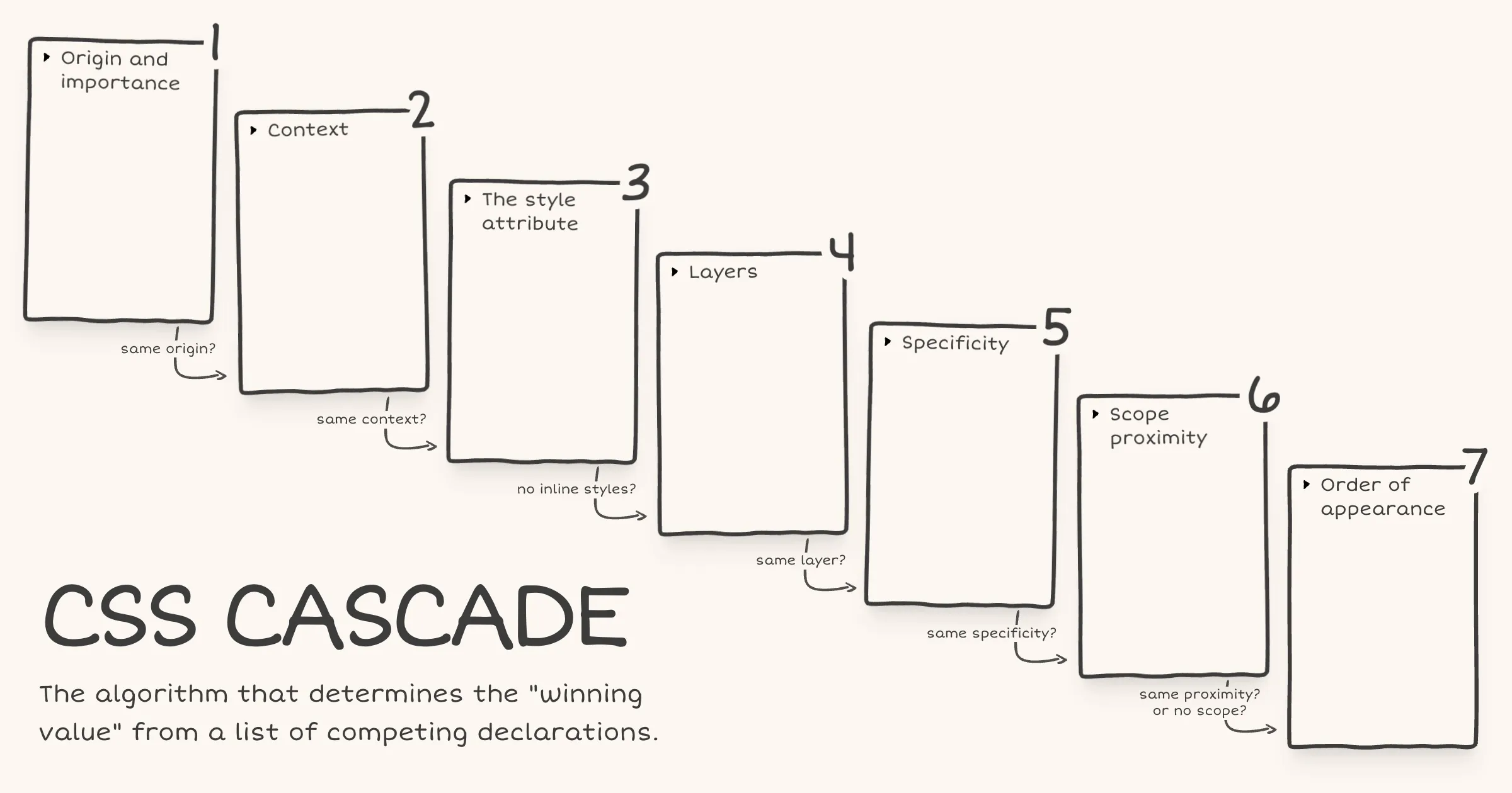
In web development, small design decisions can have a significant impact on accessibility and user experience. One such decision is how we handle borders on interactive elements.
The problem with border: none
When styling interactive elements like buttons, it’s common practice to remove default borders using
border: none. However, this approach can lead to accessibility issues, especially in high contrast mode. As demonstrated in the image below, removing the border entirely can cause buttons to appear as floating text on the page, making it difficult for users with low vision to distinguish interactive elements.
Dave Rupert explains the importance of the default border and why it exists:
In the case of interactive form controls (inputs, textareas, buttons, etc.), those pesky borders were put there because they have an accessibility benefit when using High Contrast Mode, a feature used by 30.6% of low-vision users.
The transparent border solution
To address this issue, Dave recommends making the border or outline transparent instead of removing it entirely. This can be achieved with the following CSS:
button { border-color: transparent; }As demonstrated in the image below, this approach is effective for several reasons. First, sighted users will not notice the difference. Second, as Kilian Valkhof explains, in forced color mode, the border color or outline color “will be overwritten with the current text color, making it nicely visible again without needing any special adaption or re-styling for forced color mode.”

User experience benefits
Using transparent borders offers additional benefits for user experience. Consider hover effects, for example.
button { border: none; } button:hover { border: 2px solid navy; }In such situations, applying a visible border on hover can inadvertently change the element’s dimensions. This change in size can result in a jarring visual effect.
By setting a transparent border in the default state, we ensure smooth transitions and consistent element sizes across different states.
<div> <button class="no-border-btn">Button with no border</button> <button class="transparent-border-btn">Button with transparent border</button> </div>.no-border-btn { border: none; &:hover { border: 2px solid navy; } } .transparent-border-btn { border: 2px solid transparent; &:hover { border-color: navy; } }Implications for design systems
Transparent borders are also valuable in the context of themeable design systems. Brad Frost elaborates:
When supporting multiple theme, it can be common for some themes to use borders while others don’t. This flexibility is great! Each brand is able to express themselves how they see fit. But if implemented using different border widths, shifts in the box model happen.
By using
border-color: transparentfor themes without visible borders, designers and developers can maintain consistent element sizes across different variants and themes. This approach provides the flexibility to adapt the visual design while preserving the underlying structure and layout of the components.Conclusion
Implementing transparent borders in your CSS addresses crucial accessibility concerns, enhances user experience across different display modes, and provides the flexibility needed for robust, adaptable design systems.
Note - Posted on
Thanks to Kevin Powell, today I learned that the
text-underline-offsetproperty is named so because it only applies to underlines and not othertext-decoration-linevalues likeoverlineandline-through.<a href="https://example.com">Example</a>a { text-decoration-line: underline overline; /* We can set multiple line-decoration properties at once */ text-underline-offset: 16px; /* Only impacts underline */ }
