tabindex="-1" (or any negative value) makes an element focusable if it isn’t already, and removes it from the tab order. It can still receive focus programmatically or by click, but not via the Tab key.
Tagged: accessibility
Note - Posted on
Today I learned that modal
<dialog>s opened withshowModal()can have their own<h1>.I discovered this while reading Modern Web Guidance’s HTML guide. I was skeptical at first because it’s bad practice to have multiple
<h1>s on a single web page.But this exception for modal dialogs made sense when I learned what
showModal()does. It makes the rest of the pageinertand as mentioned on MDN,inertHTML elements and their flat tree descendantsare hidden from assistive technologies as they are excluded from the accessibility tree
. So while the modal dialog is open there is no other<h1>to compete with.I’m not sure if there is consensus on this because I have seen many examples where an
<h2>was used instead.Note - Posted on
Today I learned, through Sara Soueidan’s course, Practical Accessibility, that spectacles/eyeglasses are a form of assistive technology.
I’ve worn glasses for most of my life, but I’ve never really thought of myself as someone who uses assistive technology.
It made me realize how easily we can think of assistive technology as something that exists for “people with disabilities,” rather than something many of us may rely on ourselves.
Our CSS isn't opinionated enough - craigabbott.co.uk
I think the way we currently write CSS subtly shapes the way we think about components. By having the visual styles completely decoupled from the semantic meaning, accessibility is easy to forget, because we can’t physically see missing attributes. When the styling hook is anchored to semantics, you can’t get the visual styles without also getting the parts that make it accessible.
Note - Posted on
Today I learned, adding
tabindex="-1"to skip link targets is likely no longer necessary in modern browsers.Manuel Matuzović tested skip links without
tabindex="-1"on targets across major browsers and screen readers on macOS, Windows and Android, concluding it is safe to remove in most setups, thanks to sequential focus navigation starting point.Furthermore, adding
tabindex="-1"to skip link targets also introduces a regression in usability. Withtabindex="-1"onmain, clicking on any non-interactive area insidemainmakesmainitself the focus starting point. So, the next tab press sends focus to the first focusable element inmain, not the next one after where the user clicked. The gov.uk team removedtabindexfrommainfor this reason.Getting Developers to Care about Accessibility: Carrots and Sticks - Sheri Byrne-Haber's Blog
A developer who builds accessible interfaces is more skilled. Say this out loud. Repeat it often. A developer who creates accessible interfaces isn’t doing extra work; they’re doing the work the right way.
Note - Posted on
I keep forgetting, but the
altattribute of the<img>element is not just useful for users who are visually impaired. It is also useful when the image is not displayed in the browser for whatever reason. For example: thesrcattribute does not contain a valid path to an image.While you’re fixing the fun stuff, fix the important stuff too - Piccalilli
Initially, I thought this was just an article on how to fix the janky hover state of a card component. But it also goes over the HTML markup for a typical card component in the context of semantics and accessibility.
You Want border-color: transparent, Not border: none – Frontend Masters Blog
In this article, Dave Rupert explains how testing in forced colors mode improves accessibility for users and reveals design flaws, such as excessive reliance on color cues.
Transparent borders
In web development, small design decisions can have a significant impact on accessibility and user experience. One such decision is how we handle borders on interactive elements.
The problem with border: none
When styling interactive elements like buttons, it’s common practice to remove default borders using
border: none. However, this approach can lead to accessibility issues, especially in high contrast mode. As demonstrated in the image below, removing the border entirely can cause buttons to appear as floating text on the page, making it difficult for users with low vision to distinguish interactive elements.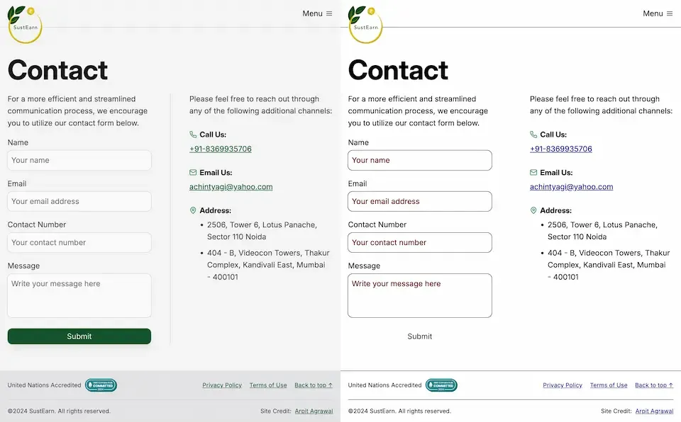
Dave Rupert explains the importance of the default border and why it exists:
In the case of interactive form controls (inputs, textareas, buttons, etc.), those pesky borders were put there because they have an accessibility benefit when using High Contrast Mode, a feature used by 30.6% of low-vision users.
The transparent border solution
To address this issue, Dave recommends making the border or outline transparent instead of removing it entirely. This can be achieved with the following CSS:
button {
	border-color: transparent;
}
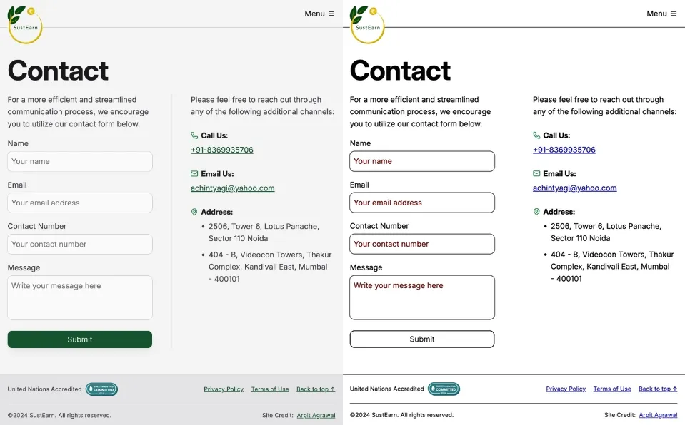
As demonstrated in the image below, this approach is effective for several reasons. First, sighted users will not notice the difference. Second, as Kilian Valkhof explains, in forced color mode, the border color or outline color “will be overwritten with the current text color, making it nicely visible again without needing any special adaption or re-styling for forced color mode.”
User experience benefits
Using transparent borders offers additional benefits for user experience. Consider hover effects, for example.
button {
	border: none;
}

button:hover {
	border: 2px solid navy;
}
In such situations, applying a visible border on hover can inadvertently change the element’s dimensions. This change in size can result in a jarring visual effect.
By setting a transparent border in the default state, we ensure smooth transitions and consistent element sizes across different states.
<div>
	<button class="no-border-btn">Button with no border</button>
	<button class="transparent-border-btn">Button with transparent border</button>
</div>
.no-border-btn { border: none; &:hover { border: 2px solid navy; } } .transparent-border-btn { border: 2px solid transparent; &:hover { border-color: navy; } }Implications for design systems
Transparent borders are also valuable in the context of themeable design systems. Brad Frost elaborates:
When supporting multiple theme, it can be common for some themes to use borders while others don’t. This flexibility is great! Each brand is able to express themselves how they see fit. But if implemented using different border widths, shifts in the box model happen.
By using
border-color: transparentfor themes without visible borders, designers and developers can maintain consistent element sizes across different variants and themes. This approach provides the flexibility to adapt the visual design while preserving the underlying structure and layout of the components.Conclusion
Implementing transparent borders in your CSS addresses crucial accessibility concerns, enhances user experience across different display modes, and provides the flexibility needed for robust, adaptable design systems.