Articles

  • Selector scoping in element.querySelector() and element.querySelectorAll()

    I was reading the MDN docs for element.querySelector() and learnt something totally unexpected about selector scope when this method is called on an element.

    Let’s say I have the following HTML:

    <div>
    	<p>This is a paragraph and it has a <span>span inside</span> it.</p>
    </div>
    
    <script>
    	const baseElement = document.querySelector('p');
    	// Note: We are querying relative to the <p> element, not the document
    	const matchedSpan = baseElement.querySelector('div span');
    	console.log(matchedSpan);
    </script>

    Once the above JavaScript is executed, what do you expect to happen?

    I expected it to log null to the console. My reasoning was simple: I am calling the method on baseElement (the <p> tag), and that paragraph clearly does not contain a <div> inside it.

    But here’s what actually gets logged to the console:

    <span>span inside</span>

    This surprisingly returns the <span> from inside the <p>.

    Why does this happen? MDN explains it like this:

    […] selectors is first applied to the whole document, not the baseElement, to generate an initial list of potential elements. The resulting elements are then examined to see if they are descendants of baseElement.

    Note: element.querySelectorAll() also applies selector scoping in the same manner.

    If we want to restrict the selector to the element on which it is called then we should use the :scope pseudo-class.

    const scopedQuery = baseElement.querySelector(':scope div span');
    console.log(scopedQuery); // Returns null, as expected

    As mentioned in the MDN docs for :scope, this works because:

    When used within a DOM API call — such as querySelector(), querySelectorAll(), matches(), or Element.closest():scope matches the element on which the method was called.
  • Safari drops support for the theme-color meta tag

    The <meta name="theme-color"> tag is no longer supported in Safari 26 on macOS and iOS.

    If a fixed or sticky element touches the top or bottom edge of the window, then and only then, Safari extends that element’s background color into the corresponding top or bottom bar. Otherwise, on iOS, the bars remain translucent and have no solid color background.

    As Wenson Hseih explained on WebKit Bugzilla:

    A solid background color extension (“top bar tint”) is only needed in cases where there’s a viewport-constrained (fixed or sticky) element near one of the edges of the viewport that borders an obscured content inset (such as the top toolbar on macOS, or compact tab bar on iOS), in order to avoid a gap above or below fixed elements in the page that would otherwise appear when scrolling. This color extension behaviour is more critical on iPhone, where there’s a much “softer” blur effect underneath the browser UI (and so more of the page underneath is otherwise directly visible).

  • Natural sorting of strings that contain numbers in JavaScript

    In JavaScript, things get interesting when you need to sort strings that contain numbers in a way that matches human expectations.

    const files = ['IMG_2.png', 'IMG_1.png', 'IMG_10.png', 'IMG_20.png'];
    files.sort();
    // Output: ['IMG_1.png', 'IMG_10.png', 'IMG_2.png', 'IMG_20.png']

    This happens because, by default, when no compare function is provided, JavaScript’s array sort() method converts the elements into strings, then compares their sequences of UTF-16 code unit values.

    This behaviour is well documented on MDN.

    So, how do we sort arrays like the ones above in a more accurate, human-friendly order?

    This is where the compare() method of the Intl.Collator API with the numeric: true option shines. It provides the natural sorting behaviour that correctly handles numbers alongside other characters.

    When numeric: true is set, the collator detects numeric substrings inside the strings and parses those substrings as actual numbers, not as sequences of digits. And then it compares the numbers numerically, not character by character.

    const naturalOrder = new Intl.Collator(undefined, {
    	numeric: true,
    }).compare;
    
    const files = ['IMG_2.png', 'IMG_1.png', 'IMG_10.png', 'IMG_20.png'];
    files.sort((a, b) => naturalOrder(a, b));
    // Output: ['IMG_1.png', 'IMG_2.png', 'IMG_10.png', 'IMG_20.png']

    Hat tip to Jan Miksovsky, whose zero dependencies SSG project led me to discover this.

  • Why is `grid-row: 1/-1` not working?

    The grid-row grid-placement property is shorthand for grid-row-start and grid-row-end.

    .grid-item {
    	grid-row: 1/-1;
    	/* is equivalent to */
    	grid-row-start: 1;
    	grid-row-end: -1;
    }

    In the above declaration, we use integers to position and size the grid item by line numbers.

    As per the spec:

    Numeric indexes in the grid-placement properties count from the edges of the explicit grid. Positive indexes count from the start side (starting from 1 for the start-most explicit line), while negative indexes count from the end side (starting from -1 for the end-most explicit line).

    The important bit is the explicit grid. This begs the question …

    What is the explicit grid?

    As per the spec:

    The three properties grid-template-rows, grid-template-columns, and grid-template-areas together define the explicit grid of a grid container by specifying its explicit grid tracks.

    Simply put, the explicit grid consists of manually defined rows and columns.

    The size of the explicit grid is determined by the larger of the number of rows/columns defined by grid-template-areas and the number of rows/columns sized by grid-template-rows/grid-template-columns. Any rows/columns defined by grid-template-areas but not sized by grid-template-rows/grid-template-columns take their size from the grid-auto-rows/grid-auto-columns properties. If these properties don’t define any explicit tracks the explicit grid still contains one grid line in each axis.

    That last bit is what leads to line -1 being the same line as 1 because the explicit grid still contains one grid line in each axis.

    What is the implicit grid?

    As Manuel Matuzovic puts it:

    If there are more grid items than cells in the grid or when a grid item is placed outside of the explicit grid, the grid container automatically generates grid tracks by adding grid lines to the grid. The explicit grid together with these additional implicit tracks and lines forms the so called implicit grid.

    Conclusion

    Paraphrasing Jen Simmons:

    • -1 is the last line of the explicit grid
    • If you haven’t defined any explicit rows, then all your rows are implicit
    • For implicit rows, -1 is the same line as 1
    • Define explicit rows and grid-row: 1/-1 will work as expected

    Further Reading

  • Transparent borders

    In web development, small design decisions can have a significant impact on accessibility and user experience. One such decision is how we handle borders on interactive elements.

    The problem with border: none

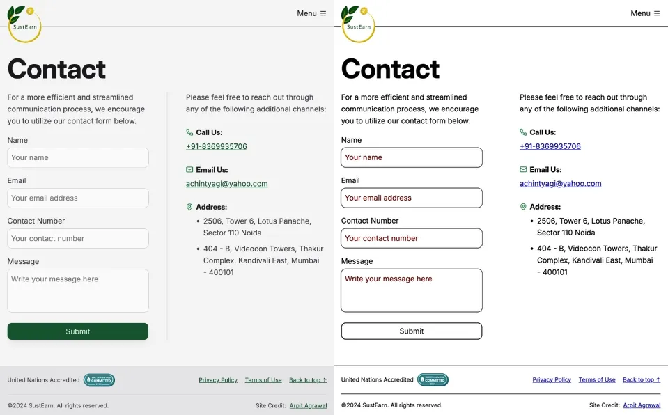
    When styling interactive elements like buttons, it’s common practice to remove default borders using border: none. However, this approach can lead to accessibility issues, especially in high contrast mode. As demonstrated in the image below, removing the border entirely can cause buttons to appear as floating text on the page, making it difficult for users with low vision to distinguish interactive elements.

    Side-by-side comparison of the contact form on Slae.app. The left image shows the contact form with forced colors disabled, displaying the default color scheme. The right image shows the contact form with forced colors enabled. In the right image, the submit button appears as floating text on the page.

    Dave Rupert explains the importance of the default border and why it exists:

    In the case of interactive form controls (inputs, textareas, buttons, etc.), those pesky borders were put there because they have an accessibility benefit when using High Contrast Mode, a feature used by 30.6% of low-vision users.

    The transparent border solution

    To address this issue, Dave recommends making the border or outline transparent instead of removing it entirely. This can be achieved with the following CSS:

    button {
    	border-color: transparent;
    }

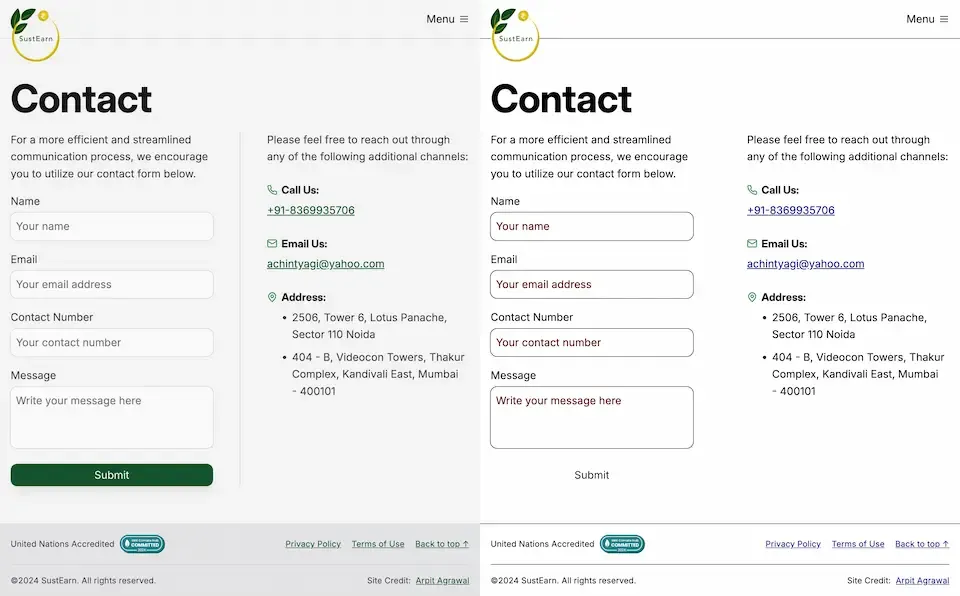
    As demonstrated in the image below, this approach is effective for several reasons. First, sighted users will not notice the difference. Second, as Kilian Valkhof explains, in forced color mode, the border color or outline color “will be overwritten with the current text color, making it nicely visible again without needing any special adaption or re-styling for forced color mode.”

    Side-by-side comparison of the contact form on Slae.app with the transparent border solution applied. The left image shows the contact form with forced colors disabled, displaying the default color scheme. The right image shows the contact form with forced colors enabled. In the right image, the submit button appears as a button.

    User experience benefits

    Using transparent borders offers additional benefits for user experience. Consider hover effects, for example.

    button {
    	border: none;
    }
    
    button:hover {
    	border: 2px solid navy;
    }

    In such situations, applying a visible border on hover can inadvertently change the element’s dimensions. This change in size can result in a jarring visual effect.

    By setting a transparent border in the default state, we ensure smooth transitions and consistent element sizes across different states.

    <div>
    	<button class="no-border-btn">Button with no border</button>
    	<button class="transparent-border-btn">Button with transparent border</button>
    </div>
    .no-border-btn {
    	border: none;
    
    	&:hover {
    		border: 2px solid navy;
    	}
    }
    
    .transparent-border-btn {
    	border: 2px solid transparent;
    
    	&:hover {
    		border-color: navy;
    	}
    }

    Implications for design systems

    Transparent borders are also valuable in the context of themeable design systems. Brad Frost elaborates:

    When supporting multiple theme, it can be common for some themes to use borders while others don’t. This flexibility is great! Each brand is able to express themselves how they see fit. But if implemented using different border widths, shifts in the box model happen.

    By using border-color: transparent for themes without visible borders, designers and developers can maintain consistent element sizes across different variants and themes. This approach provides the flexibility to adapt the visual design while preserving the underlying structure and layout of the components.

    Conclusion

    Implementing transparent borders in your CSS addresses crucial accessibility concerns, enhances user experience across different display modes, and provides the flexibility needed for robust, adaptable design systems.