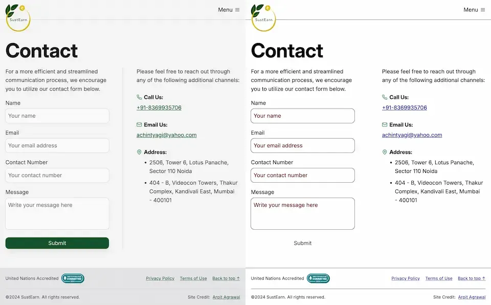
In web development, small design decisions can have a significant impact on accessibility and user experience. One such decision is how we handle borders on interactive elements.
The problem with border: none
When styling interactive elements like buttons, it’s common practice to remove default borders using border: none. However, this approach can lead to accessibility issues, especially in high contrast mode. As demonstrated in the image below, removing the border entirely can cause buttons to appear as floating text on the page, making it difficult for users with low vision to distinguish interactive elements.

Dave Rupert explains the importance of the default border and why it exists:
In the case of interactive form controls (inputs, textareas, buttons, etc.), those pesky borders were put there because they have an accessibility benefit when using High Contrast Mode, a feature used by 30.6% of low-vision users.
The transparent border solution
To address this issue, Dave recommends making the border or outline transparent instead of removing it entirely. This can be achieved with the following CSS:
button {
	border-color: transparent;
}
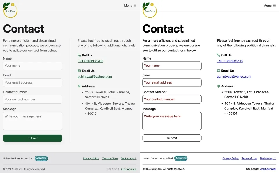
As demonstrated in the image below, this approach is effective for several reasons. First, sighted users will not notice the difference. Second, as Kilian Valkhof explains, in forced color mode, the border color or outline color “will be overwritten with the current text color, making it nicely visible again without needing any special adaption or re-styling for forced color mode.”

User experience benefits
Using transparent borders offers additional benefits for user experience. Consider hover effects, for example.
button {
	border: none;
}

button:hover {
	border: 2px solid navy;
}
In such situations, applying a visible border on hover can inadvertently change the element’s dimensions. This change in size can result in a jarring visual effect.
By setting a transparent border in the default state, we ensure smooth transitions and consistent element sizes across different states.
<div>
	<button class="no-border-btn">Button with no border</button>
	<button class="transparent-border-btn">Button with transparent border</button>
</div>
.no-border-btn {
	border: none;

	&:hover {
		border: 2px solid navy;
	}
}

.transparent-border-btn {
	border: 2px solid transparent;

	&:hover {
		border-color: navy;
	}
}
Implications for design systems
Transparent borders are also valuable in the context of themeable design systems. Brad Frost elaborates:
When supporting multiple theme, it can be common for some themes to use borders while others don’t. This flexibility is great! Each brand is able to express themselves how they see fit. But if implemented using different border widths, shifts in the box model happen.
By using border-color: transparent for themes without visible borders, designers and developers can maintain consistent element sizes across different variants and themes. This approach provides the flexibility to adapt the visual design while preserving the underlying structure and layout of the components.
Conclusion
Implementing transparent borders in your CSS addresses crucial accessibility concerns, enhances user experience across different display modes, and provides the flexibility needed for robust, adaptable design systems.

